A successful color plan does more than make individual rooms attractive. It creates visual rhythm from the front door to private spaces, supports changing light, respects permanent materials and still feels personal after trends have moved on.
Interior Paint Colors Atlanta: The Practical Answer
There is no single color that fits every Atlanta property. A bright Midtown condominium, a shaded Decatur bungalow, a traditional Marietta home and newer construction in Alpharetta experience light differently. Even identical plans can render one sample differently when one faces wooded shade and another receives open western sun. The reliable method is to move from permanent features to undertones, from undertones to a small family of candidates, and from candidates to large samples observed over time.
Color is also only part of the finished result. Old caulk, dents, glossy patches, stains and uneven drywall change reflection and make a beautiful shade look inconsistent. When the substrate needs correction, professional drywall repair in Atlanta establishes the uniform surface needed for a premium finish.
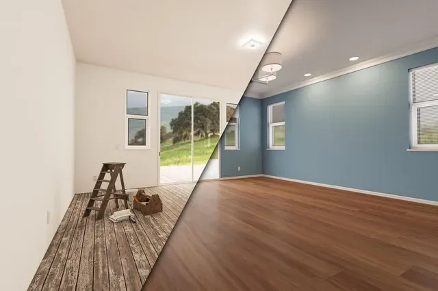
Build the Color Plan From What Will Not Change
Paint is easier to change than flooring, stone, cabinets, tile and major furniture. Those permanent elements should lead the palette. Hold samples beside the actual floor and countertop rather than viewing them alone. Warm oak can make a cool gray appear blue. Cream stone can make a crisp white feel sterile. Charcoal upholstery can reveal green or violet inside a neutral that looked simple at the store.
List the dominant colors in each room and decide whether they feel warm, cool or balanced. Warm materials commonly contain yellow, gold, red or orange. Cool finishes lean toward blue, green or violet. Balanced materials can bridge both, but they still have an undertone. The goal is not to match everything. It is to prevent accidental conflict and establish a repeatable relationship.
Define the feeling before naming a color
Describe the desired experience: brighter, quieter, warmer, cleaner, intimate, architectural or playful. “Calm and warm” is a better brief than “beige,” because the best answer may be putty, mushroom, cream or a softened white. Consider who uses the room, the time of day it is occupied, cleaning frequency and whether architecture or furnishings should lead.
Walk through connected areas and identify sightlines. Open plans need colors that can be viewed simultaneously. Hallways must mediate several rooms. Note natural stopping points such as inside corners, cased openings and ceiling changes. Avoid a transition in the middle of an uninterrupted wall. When architecture offers no clean break, one shared wall color is usually the most polished solution.
How Atlanta Light Changes Paint Throughout the Day
Color is reflected light, not a fixed visual fact. Atlanta's tree canopy can cast green into rooms during the growing season. Strong summer sun intensifies warm tones. Cloudy storm light cools an interior quickly. In winter, reduced foliage may allow direct sun through a previously shaded window. These shifts explain why a small chip under retail lighting cannot predict a finished room.
North-facing spaces usually receive cooler, steadier light. Blue-white and cool gray may become colder, while warm off-white can retain comfort. South-facing rooms receive abundant warmer light and may support cooler or deeper choices. East-facing rooms glow in the morning and cool later. West-facing rooms do the opposite, developing strong late-day warmth that can exaggerate yellow, peach and red.
Orientation is only a starting point. Porches, neighboring buildings, tinted glass and heavy foliage may override it. Turn on the lamps used in daily life. Warm 2700K bulbs and cooler bulbs produce different versions of the same wall. Use consistent lamp temperatures across an open area so the palette does not fracture after sunset.
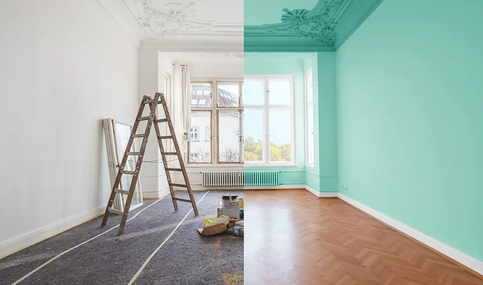
Undertones Make the Difference Between Close and Correct
Undertone is the quieter color beneath the first impression. Two whites may look alike until one is placed beside the other; one leans yellow while the other looks blue. Neutral grays can carry green, violet or blue. Beige may contain pink, gold or green. These directions become obvious beside permanent finishes or competing neutrals.
Identify undertones through comparison, not memory. Place samples beside a known clean white and beside one another. Then compare finalists with every important finish. A neutral that works with the floor but fights the countertop is unresolved. In an open plan, view it from adjacent rooms as well.
Repeating an undertone creates cohesion. If stone and wood share subtle warmth, a compatible wall neutral feels intentional. Designed contrast also works: a deep blue study beside warm wood reads clearly as contrast. Two nearly matching neutrals with incompatible undertones simply appear mistaken.
Create a Whole-Home Palette Without Making Every Room the Same
Cohesion does not require one shade everywhere. A useful plan contains a primary neutral, a trim color, two or three supporting colors and selected accents. The neutral connects circulation spaces. Supporting colors respond to function and light. Accents create moments in dining rooms, studies, cabinetry, doors or powder rooms.
Repeat something so variety feels organized. Carry the same trim throughout, echo a green undertone from the living area in kitchen cabinets, or repeat a bedroom blue on a built-in. The repeated element can be hue, value or undertone. Maintain enough contrast between walls and trim to look deliberate; near matches can look like tinting errors.
Ceilings are part of the plan. Bright white emphasizes crown molding and height. A softened version of the wall reduces contrast. Carrying wall color overhead creates intimacy. The correct strategy depends on ceiling height, daylight and whether architecture should be emphasized.
Need a trained eye in your actual rooms?
Our Atlanta interior painting team evaluates surfaces, transitions and finish requirements before work begins.
Request a Free Estimate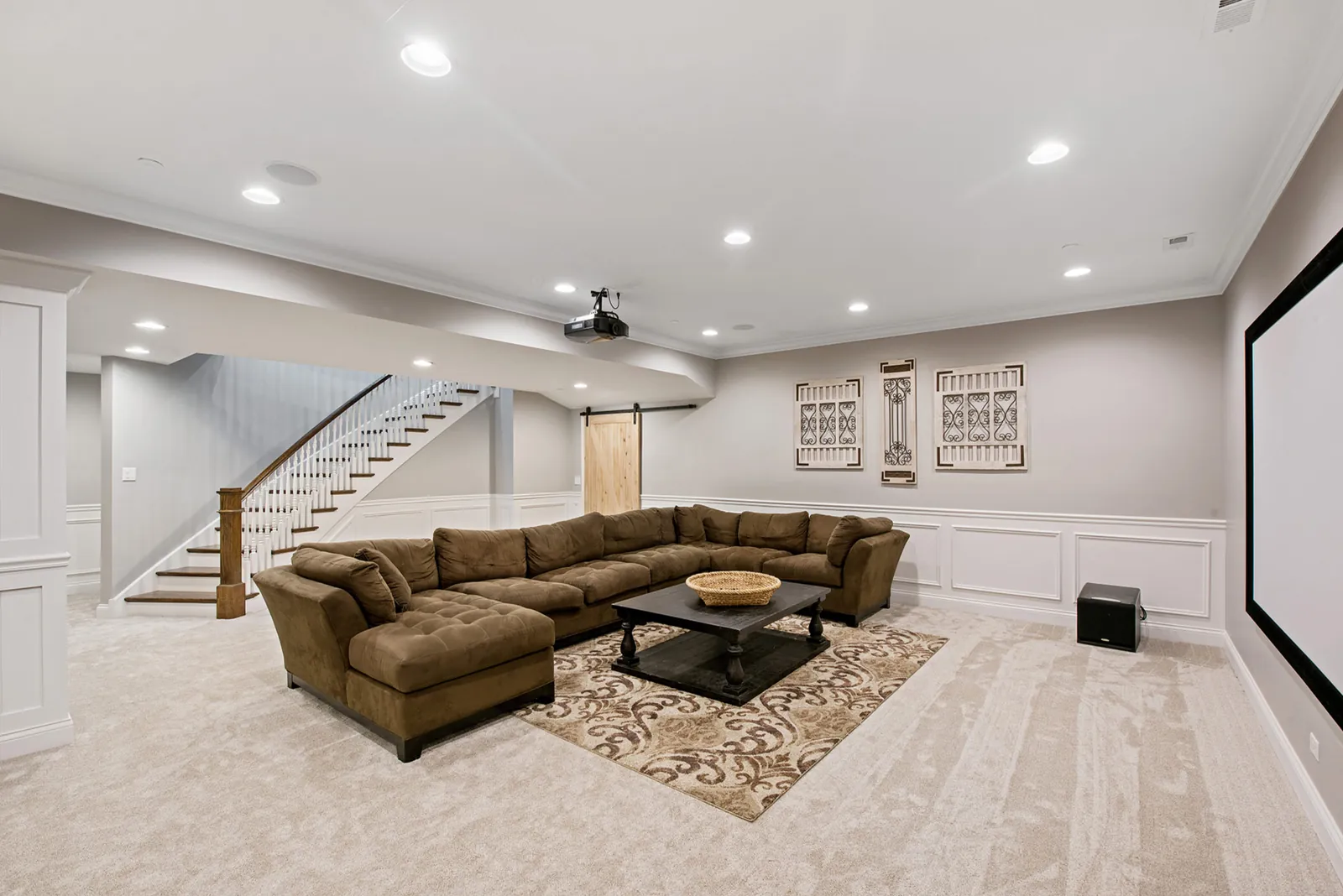
Room-by-Room Color Decisions
Living rooms and open gathering spaces
Living rooms coordinate upholstery, rugs, wood, art, electronics, windows and outdoor views. Begin with the largest textiles and flooring. Pull a direction from them without matching literally. Muted neutral walls allow art and furniture to lead; deeper walls can make pale upholstery and trim more defined.
White does not automatically make a dark room sunny. White reflects available light; it does not create it. In weak light, a crisp white can appear gray and flat. Cream, pale mushroom or restrained color may feel richer. In bright western light, confirm that a warm white does not become excessively yellow.
Kitchens and cabinets
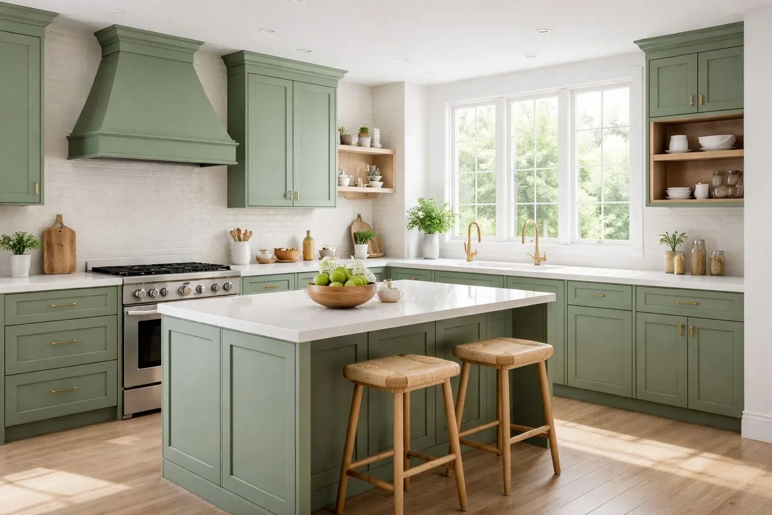
Compare kitchen color with counters, backsplash, floor, appliances and hardware. Patterned stone usually benefits from a quieter wall. Cabinet color carries greater visual weight. Soft white opens a compact kitchen; sage, olive, navy and charcoal create furniture-like presence. Green pairs naturally with warm wood and brass, but yellow-green and blue-green produce different moods.
Walls and cabinets need a relationship, not a match. Strong cabinets often need quiet walls connected by undertone. Neutral cabinets leave space for stronger walls. Our cabinet painting service uses preparation and coating systems intended for surfaces handled every day.
Bedrooms
A restful bedroom can be warm, cool, light or deep. Low visual noise matters more than a formula. Muted blues and greens connect with natural materials, while mushroom, clay and warm gray feel grounded. Deep blue-green, brown or charcoal can create enclosure in a room mainly used at night.
Coordinate walls with bedding and window treatments, but avoid basing the whole room on one temporary accessory. Children's rooms can use adaptable walls with highly specific color in art and textiles. A tinted ceiling softens contrast; carrying the wall overhead creates a cocooning effect.
Bathrooms
Bathrooms place tile, stone, vanity and wall close together, magnifying undertone conflict. Test samples vertically beside tile and near countertops. Humidity also makes preparation and product selection important. Color cannot repair condensation, failed caulk or active moisture. Ventilation must function and surfaces must be sound.
Hallways, basements and small rooms
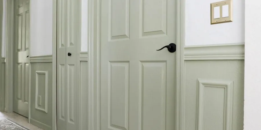
Hallways connect several palettes and are viewed from many angles. A dependable neutral and consistent trim usually outperform an isolated trend shade. Repeated door color can create architecture; see our door painting service. Windowless rooms do not always need white. A controlled mid-tone can look more intentional under artificial light.
Basements contain mixed lighting, shadows and lower ceilings. Warm neutrals can counter cool slab-level light, but moisture must be corrected first. Our basement painting specialists evaluate conditions before recommending a coating plan.
Sheen Changes Both Color and Performance
Higher sheen reflects directional light, enriches color and highlights defects. Flatter finishes scatter light and soften walls. Washable matte or eggshell often suits living spaces, while kitchens and baths may need more cleaning resistance. Product names differ, so one brand's eggshell may not look like another's.
Use the lowest sheen that meets performance needs. Unnecessary gloss exposes patches, roller texture and waviness. Trim commonly benefits from increased durability and subtle contrast. Cabinets require a dedicated coating system rather than ordinary wall paint.
VOC content is separate from sheen. The U.S. Environmental Protection Agency notes that paints and other products can emit volatile organic compounds and recommends ventilation and following label precautions. Discuss product, ventilation and occupant sensitivity before work starts.
Sample Paint Like a Professional
Narrow the field to three or four serious candidates. A wall covered in unrelated swatches creates confusion. Apply large samples on movable boards or multiple walls, keep them separated, label each and view them from adjoining spaces.
Observe finalists beside trim and fixed finishes during sunny, cloudy and evening conditions. Digital tools from Sherwin-Williams and Benjamin Moore help narrow families, but screens are not color standards. Verify physical samples in the product and sheen intended for the room.
Allow samples to dry. Surrounding old color influences perception, which is another reason to make samples large. Move a board around the room. A candidate that is balanced on one wall may reveal an unwanted cast on another.
Preparation Determines Whether Color Looks Premium
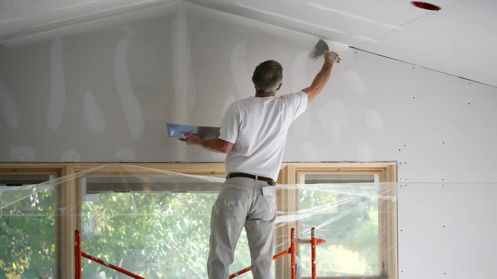
Clean walls, repair holes and cracks, address stains, sand rough transitions, remove failed caulk and prime where appropriate. Painting over a defect does not remove it; fresh, light-reflective color may make it more visible. New drywall, repaired areas, porous surfaces, stains and major color changes often require primer.
Wallpaper removal requires care because adhesive residue interferes with paint and damaged paper facing may need sealing. Our wallpaper removal service prepares the substrate for a clean coating system. Textured-ceiling removal similarly requires containment, repair and finishing; review our popcorn ceiling removal service.
Professional preparation is systematic. Floors and furniture are protected, hardware is managed, cracks are investigated rather than hidden and repairs are blended into surrounding texture. The final color can then read as one continuous surface.
Common Color Mistakes and Better Alternatives
Choosing from a screen
Displays vary, photographs are edited and surrounding colors influence perception. Use online inspiration for direction, then approve physical samples.
Ignoring existing trim
A new white wall beside old creamy trim can make the trim appear dirty. Decide whether trim stays, changes or deliberately contrasts before selecting walls.
Following a trend without reading the house
A fashionable hue works when it supports architecture and materials. It fails when copied from a completely different room. Let the home filter the trend.
Using unrelated accent walls
One accent in every room fragments the plan. Use fewer moments and repeat the accent or its undertone elsewhere.
Forgetting evening conditions
Many households occupy their interiors after work. A color approved only at noon may disappoint under lamps. Night viewing is part of sampling, not an afterthought.
Buying paint before calculating scope
Color, product, sheen and preparation must be confirmed together. Premature purchases can create waste or force a finish that is wrong for the surface.
Trim, Ceilings and Architectural Details Complete the Palette
Wall color receives most attention, yet trim, doors, ceilings, built-ins and wainscoting define how the palette is framed. Treating every element as automatic bright white can work, but it should be a decision rather than a default. Softer white connects naturally with warm walls and aged wood. Cleaner white sharpens contemporary architecture. Using wall color on trim in a different sheen creates a tailored effect that emphasizes form through reflection instead of contrast.
Inspect existing enamel in several rooms. Older homes may contain different whites from separate renovations. New wall paint exposes those differences, making one doorway appear yellow while another looks gray. Decide whether the project includes all visible trim, selected rooms or no trim. A defined scope prevents an unfinished appearance and makes estimates easier to compare.
Use contrast to control attention
Strong contrast outlines every opening, baseboard and molding profile. That is useful when millwork is detailed and worth celebrating. Low contrast calms a room and makes modest trim less prominent. Color-drenched rooms—walls, trim and sometimes ceilings in one hue—create continuity, while differences in sheen and light keep each plane visible. The approach can be sophisticated in studies, dining rooms and bedrooms when sampled carefully.
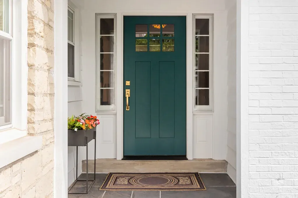
Doors create repetition. Deep green, blue, brown or charcoal across several doors establishes rhythm and gives ordinary elements presence. Door color should respond to flooring and hardware. Review doors open and closed because each belongs visually to two rooms. A color that complements one side but conflicts with the other needs adjustment or a planned transition.
Ceiling color changes proportion
A bright ceiling above medium walls can feel higher because of contrast. A tinted ceiling softens the boundary and unifies a broad room. Deep ceilings lower the perceived plane and create intimacy. In open plans with changing ceiling heights, one consistent ceiling neutral often controls transitions. Test overhead samples horizontally; a color held vertically receives different light and cannot accurately predict the ceiling.
Fireplaces, bookcases, beams and stairs also belong to the plan. Decide whether each should blend, support or lead. A fireplace painted with the wall recedes. A contrasting built-in becomes furniture. When every feature competes, hierarchy disappears. When one leads and others support it, a complex palette still feels calm.
Budget, Maintenance and Future Flexibility
The lowest paint price is not always the lowest project cost. Coverage, preparation, coats, access, repairs and durability affect labor and long-term value. Moving from deep color to pale neutral may require primer or additional coats. High walls and detailed trim require more protection and setup. Compare the complete coating system rather than gallons alone.
Plan for how rooms age. Entries collect hand marks, kitchens need cleaning resistance and sunny rooms expose fading or touch-up differences. Dark colors can show dust and scuffs; pale colors may reveal fingerprints. Neither is automatically wrong. Product, sheen and maintenance expectations simply need to support the visual choice.
Save color names, product lines, sheen, formulas and room locations. Store a small sealed amount for repairs, but recognize that touch-ups may flash when existing paint has aged or application texture differs. Larger damage usually looks better when the entire wall is recoated corner to corner. Label leftovers with date and surface and follow local storage and disposal guidance.
Future flexibility matters. A restrained foundation allows furnishings and art to change without repainting everything. Personality can live in architecturally purposeful places: a study, dining room, cabinet run, repeated doors or ceiling. A clear hierarchy distinguishes foundational colors from accents and makes later changes easier.
Create a written room schedule before work begins. Record walls, ceilings, trim, doors, closets, colors and sheen for each space. Confirm which side of each door belongs to which palette and where transitions occur. This document prevents assumptions, supports accurate pricing and gives the crew a shared reference throughout the project.
What a Professional Interior Painting Process Includes
A dependable process begins with questions. Define rooms, surfaces, repairs, colors, finishes, access and sequence. Protect belongings and floors. Prepare systematically. Use compatible products and inspect in useful light. Clear communication matters because drying time and room order affect daily life.
Execution creates consistency across large walls: clean cut lines, even roller texture, full coverage and stable sheen. Repairs should disappear. Doors, trim and cabinets need application methods suited to handling. A final walkthrough catches small items before furniture returns.
Impeccable Painting Services serves Metro Atlanta with interior and exterior painting, cabinets, doors, basements and surface repair. Explore our project gallery, confirm coverage on our service areas page, or learn more about interior painting in Atlanta.
Turn a confident color plan into a beautiful finish
We can inspect the surfaces, define the scope and provide a free, no-obligation estimate.
Get Your Free EstimateFrequently Asked Questions
What colors work best in Atlanta homes?
Colors tested in real light and coordinated with permanent finishes work best. Warm whites, neutrals, greens and blues are starting directions, not universal answers.
Should every room use the same color?
No. Repeating trim, a primary neutral or a shared undertone creates cohesion while allowing selected rooms to carry deeper supporting colors.
How many samples should I test?
Test three or four finalists in large areas on more than one wall, then view them morning, afternoon and evening.
What sheen is best?
Matte or eggshell commonly suits living areas; washable finishes may benefit kitchens, baths and busy spaces. Surface condition and light also matter.
Can painters repair walls first?
Yes. Impeccable Painting Services provides drywall repair and preparation so texture, primer and final sheen remain consistent.

About Impeccable Painting Services
We help Metro Atlanta homeowners transform interiors through careful preparation, clean detail and premium finishes, including walls, cabinets, doors, basements and specialty surface services.
Sources: U.S. EPA: VOCs and indoor air quality; U.S. EPA: Care for Your Air; Sherwin-Williams Color; Benjamin Moore Paint Colors.